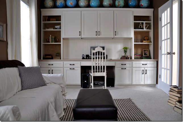
Do you have one of those rooms in your home that you just aren’t sure how to decorate? Yeah, me too.
That room is our office. It continues to baffle me. It’s the only room left on our main level that needs a loving decorating touch.
Here’s what it looks like currently…


Well, minus the curtains. They went to live with my parents because there was just too much ivory going on in the room. You live. You learn. The parents did give me life so it was only fair they get my hand me down curtains.
I think we are going to purchase the Karl sectional (the smallest version available) from Ikea. My brother purchased it and it’s comfy. This room doesn’t get a ton of use but we would like to use it a little more for lounging and a semi-inexpensive sectional seems like a good fit.
I think I’ve decided that I actually like the wall color. My laziness may be working it’s magic on my brain too. I can’t tell for sure. How do you feel about it?
My biggest conundrum now is what to put behind the couch…or soon to be sectional.

I ponder this space while running 30 minutes three times per week. I’ve got nothing. That’s 90 minutes per week for the past 4 months and no ideas. Okay, fine…probably more like 30 minutes of pondering per week. The other 60 minutes are focusing on not dying. But still. (I highly recommend decorating rooms while you run. It’s amazing how fast the time flies. Seriously.)
There’s art. But what kind of art? I like things to have a purpose. A map would be an obvious choice but that seems a little themey to me. I had pondered some kind of word art but word art can turn cheesy real quick like. And what word? I thought about shelves with photos but I want something a little unique.
Maybe I just need to run more.
What are your thoughts? What’s your go-to behind the couch solution? Help! Share those genius ideas!
Do you have a room that needs help that you would like Décor and the Dog readers to assist you with? E-mail me at decorandthedog (at) gmail.com.
Do you have one of those rooms in your home that you just aren’t sure how to decorate? Yeah, me too.
That room is our office. It continues to baffle me. It’s the only room left on our main level that needs a loving decorating touch.
Here’s what it looks like currently…


Well, minus the curtains. They went to live with my parents because there was just too much ivory going on in the room. You live. You learn. The parents did give me life so it was only fair they get my hand me down curtains.
I think we are going to purchase the Karl sectional (the smallest version available) from Ikea. My brother purchased it and it’s comfy. This room doesn’t get a ton of use but we would like to use it a little more for lounging and a semi-inexpensive sectional seems like a good fit.
I think I’ve decided that I actually like the wall color. My laziness may be working it’s magic on my brain too. I can’t tell for sure. How do you feel about it?
My biggest conundrum now is what to put behind the couch…or soon to be sectional.

I ponder this space while running 30 minutes three times per week. I’ve got nothing. That’s 90 minutes per week for the past 4 months and no ideas. Okay, fine…probably more like 30 minutes of pondering per week. The other 60 minutes are focusing on not dying. But still. (I highly recommend decorating rooms while you run. It’s amazing how fast the time flies. Seriously.)
There’s art. But what kind of art? I like things to have a purpose. A map would be an obvious choice but that seems a little themey to me. I had pondered some kind of word art but word art can turn cheesy real quick like. And what word? I thought about shelves with photos but I want something a little unique.
Maybe I just need to run more.
What are your thoughts? What’s your go-to behind the couch solution? Help! Share those genius ideas!
Do you have a room that needs help that you would like Décor and the Dog readers to assist you with? E-mail me at decorandthedog (at) gmail.com.


I actually love that room... the globes on the top of the desk are genius! Might be fun to do a large abstract painting on canvas or old wood above the couch. Keep it pretty neutral and pull in some blues from the globes...? I wouldn't do a map because it would get themey since you have a large collection of globes already... So that is my suggestion... hope it helps :)
ReplyDeleteI love the wall color. What about an interesting mirror to give some more light to the room? I've also become a huge fan of sofa tables since I recently put one in. It's the best and lamps behind a couch add a lot of interest.
ReplyDeleteWe briefly owned a Karl ... have you heard Kim's theories on IKEA couches? You should listen :)
ReplyDeleteAlso, totally have a room, well more of a nook/space, that needs some love in our living room ... I will email you!
I don't know who Kim is but I want to hear her theory...
DeleteFirst of all, I love that room. The whole desk/globe area has always been one of my favorites - and the room is huge! I like the idea of a sofa table and lamps behind the couch. I just did that in my conservatory because of space restrictions and I love the way it looks. I haven't posted on it yet because that room is still pretty much a disaster besides the sofa table addition. Anyway, your wall color is great with the white - and and I love your rug too. You are right, a map might be too themey on that wall. Maybe I should go for a run and think about it...I could really use some exercise! Either way, Ike makes the perfect accessory!
ReplyDelete-Shelley
i love the room, too- since you already have the globes a huge map or some kind of worldly reference would be cool. i love that map i have seen floating around pinterest and have repinned that says "joy to the world" on it. it may be somewhat christmas-y but i think it could last all year. i mean, we should hae joy all the time right. except while running. i never find the joy there.
ReplyDeleteI like the wall color but I think it'll really depend on what color couch you get... but I really hope it matches and you don't have to repaint.
ReplyDeleteWould it be overkill if you did geography type art since you've got globes in there already? It might be cool if you got some colorful prints from Etsy and maybe vintage maps in fun frames.
I love the wall color! I think it's really pretty. Maybe this is goofy, but hey, I'm a new homeowner, cut me some slack . . . what about a doggy wall? Not cutesy stuff, but sort of sophisticated looking, yet still kinda goofy/fun, prints like this: http://www.etsy.com/listing/99310430/dictionary-print-art-vintage-stacked?ref=sr_gallery_6&ga_search_query=dog+dictionary+print&ga_view_type=gallery&ga_ship_to=ZZ&ga_search_type=all
ReplyDeleteLong link, sorry. I don't know, I think it could be kinda cute and funny, maybe? And it would be a good place to get away with something kind of silly and Ike-related since it's not a room that probably tons of people are seeing all the time.
what about a thin table behind the couch with lamps?
ReplyDeleteI think the wall behind your Karl-to-be-sectional deserves a massive oil portrait of Ike.
ReplyDeleteI so ♥ your globes & they give a marvelous pop of blue/green to your space. What color did you use in your replacement curtains?
A salvaged old-school roll-up set of maps would be theme-y, but waaaaaaay cool!
Throw in a bust of some ancient Roman and add a spotlight lamp and you're looking at a Restoration Hardware room. Nah, for real, the room looks good as is. I'm good at building things but decorating is where I fall short and pass the batton to Lisa. I actually DO like the map idea behind the couch. You could get a big Iowa map or maybe an old world map. Word art is a good idea... I don't have any serious suggestions for words though. :)
ReplyDeleteI love the globes- maybe pull some of the colors from the globes into other parts of the room- in pillows, wall art, etc- I like your frame wall behind the couch- you could spray paint the frames some fun colors to brighten things up? Might be a fun contrast with the black and white photos.
ReplyDeleteNo map, I think it would be too much with all of the globes. I actually like the gallery wall, but what about spray painting the frames the colors in the globe? Or getting a good mix of frames, little shelves, etc?
ReplyDeletehttp://coffeebeansandbobbypins.blogspot.com
I like the wall color....I'm always drawn to browns, but I'm trying to resist it at least to some extent in this house because it seems like every room we painted in the old house ended up green or brown. I'm branching out. LOVE the globes...I think with some more pops of color like that, the room will look really lovely. We just did a small gallery wall with Ikea Ribba picture ledges behind our couch.
ReplyDeleteWhat about a graphic oversized piece of art? You could DIY something like this http://pinterest.com/pin/43065740156233923/ or this http://pinterest.com/pin/43065740156230234/
ReplyDeleteI have a sofa table we aren't going to use in the new house if you want it :o) I think you should print out some of Nate's photos from the vacations you have taken (like the doors from Georgia, Sedona pics, etc.) and put them up. You could even get them printed on canvas instead of putting them in photo frames.
ReplyDeleteOffices are my bane. Ours is currently empty except for some random tools and a lot of dust. As for above your couch, I vote mounted deer head. :)
ReplyDeleteI love the idea of a large mirror, or maybe several square mirrors hung together to create a large mirror? Or some abstract art on a larger scale?
ReplyDeleteI have a ton of great ideas, but I never have the money/motivation to make them happen for myself.
I don't know why you don't use this room much, it's gorgeous! A lot of work has already been done here - the awesome built-in desk with cabinets, nice wall colour, not to mention the space is pretty big and the ceilings looks high! (Is it just me, or are those higher than 8 ft ceilings?). The artwork you already have is actually quite nice because a grouping of frames provides a larger impact than a single piece. I would bring up the curtain roads right up to right underneath the crown moulding. I would swap the ottoman with a more rustic coffee table (something more natural). I would also bring in a plant or two. Those are just some thoughts...
ReplyDeleteYikes... curtain RODS, not roads.
ReplyDeleteMy definite go-to for behind the sofa is always a sofa table for putting books and glasses (drinking or reading), etc. I love the wall colour but maybe an additional, brighter colour in the form of art, pillows will give you the happiness factor you're looking for.
ReplyDeleteI really love the globes over the desk space! I think the previous suggestions of adding some pops of blue and green are great ones. I also like the idea of making the gallery wall either dog themed or travel themed with photos of your vacations or something since that would be a subtle nod to the globes but wouldn't be as in your face as a large map might be.
ReplyDeleteIt already looks great! I like the sofa table behind the sectional idea and I agree that the curtain rods should be higher. I think you could get away with a map on the wall behind the couch if you did a vintage style that wasn't similar colors to the globes.
ReplyDeleteI think a great piece of string art would be awesome....maybe on some whitewashed barnboard? The state of Iowa?
ReplyDeleteLike This but with different wood and different string color?
http://www.etsy.com/listing/74164934/mixed-media-nail-wire-california
I vote sofa table. Fill it with identical lamps and some other crap. Hang some crap on the wall to fill up any leftover space.
ReplyDeleteI like the color. Do a narrow sofa table, and no maps because your globes need all the glory.
ReplyDeleteI'd recommend those yellow TV characters but I might get in trouble....
ReplyDeleteHanging stuff on the walls in our living room has me perplexed. Darn vacant holes staring at me.
what about some of the beautiful pictures from your recent trip? Then you can start collecting pictures from all of your trips which would go with your map theme as well.
ReplyDeleteamanda hetland
i have a whole house that needs decorating help from readers ;)
ReplyDeleteI would say stay away from the maps because yes, too themey. What about some other fun art idk i am thinking something fun with pennies framed? where did i come up with this? Idk, maybe it's all the fumes from the staining and painting i've been doing the past two evenings...dont listen to me!!
An Ike's portrait made by Dean Russo, would bring some bright colours to the room
ReplyDeletei would put a map of Iowa or your hometown or spell Iowa out or Iowa and pictures of Iowa.
ReplyDeleteI'll have to search to find who did this project, but someone had a distressed mirror that had a poem stencilled on-- if you like that sort of thing. Otherwise you could do some names, or your last name, or a sillouette of Ike, or some totally different thing... but I love how distressed mirror-surfaces look, other people don't. Just an idea.
ReplyDeleteI also really like the idea of a large colourful abstract that pulls blues from the globes, and maybe a little green from the accent pieces. possibly on just wood, if you want to do it yourself?
I like the wall colour as is. I'm a fan of painting the walls fairly neutral, and accenting the room other ways. :)
i love the sofa table idea as well - you can always build a shelf like this: http://shoestringsophistication.blogspot.com/2011/11/updates-during-my-blogging-absence.html and a mirror . or mixed media gallery - with antlers. i've been obsessed with them lately and need to buy some. I'm thinking the z gallerie ones.
ReplyDeleteAnd I was going to say a map, lol.
ReplyDeleteIn comparison to my entire house this room is 100% decorated already!
Maybe you need to make some DIY art. Something like Erin (at His & Hers) big giant "&" she made a while ago...
My vote goes to a pull down scientific diagram. It's cheeky and school like without getting too themed with the maps.
ReplyDeleteMy work is done here.
I need to stop listening to books while I run and start figuring out my design dilemmas. God, commenting on your posts today is turning my really bad day into a much better one.
ReplyDeleteHow about a photo clock? Function and a unique kinda gallery wall. Check out pinterest and search for photo clock. Ill definately be adding one in our new home, although I think some of the examples are a little uniform, maybe more differnet sized frames, or different spacing would work on the same degree lines. Just an idea ;D
ReplyDelete